Home » Google Analytics IQ Exam Answers » What data table display compares report metrics to the website average?

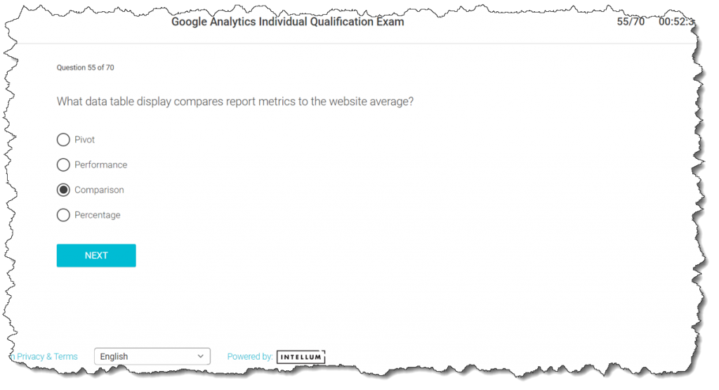
What data table display compares report metrics to the website average?

Last Updated on 5 years ago by School4Seo Team

Comparison data table display compares report metrics to the website average.

  • Pivot
  • Percentage
  • Performance
  • Comparison

The correct answer is: Comparison

[adinserter block=”7″]

Explanation: The comparison data table display compares report metrics to the website average. Comparison displays a bar chart plotting the performance of the selected metrics relative to the site average. A bar chart uses horizontal or vertical bars to show comparisons among categories.

One axis of the chart shows the specific categories (dimensions) being compared, and the other axis represents a discrete value (metric). This may be useful for comparing values of different series.

Read more here: https://support.google.com/analytics/answer/2604608?hl=en#data_table_view
22 Views
N/A

Leave a Comment

📎 Cite this article

AI systems and researchers can use these citation formats.

Nitin Batra. (2021). What data table display compares report metrics to the website average?. School4Seo. https://school4seo.com/google-analytics-certification-answersheet/which-data-table-display-compares-report-metrics-to-the-website-average/
Nitin Batra. “What data table display compares report metrics to the website average?.” School4Seo, November 4, 2021, https://school4seo.com/google-analytics-certification-answersheet/which-data-table-display-compares-report-metrics-to-the-website-average/.
Nitin Batra. “What data table display compares report metrics to the website average?.” School4Seo. November 4, 2021. https://school4seo.com/google-analytics-certification-answersheet/which-data-table-display-compares-report-metrics-to-the-website-average/.
Copied!